5 Things You Should Know About Your Blog Sidebar
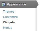
 Your WordPress sidebar is made up of “widgets”. To add or edit your widgets, go to Appearance, Widgets in your WordPress dashboard and start dragging and dropping your widgets into the appropriate sidebar. Some themes have only one sidebar, others have multiple sidebar and footer options. Often, the secondary sidebar doesn’t show unless the theme has two sidebars, so if you drag widgets into the secondary sidebar and they don’t appear, that’s why.
 The most basic widget is the Text widget. It’s where you can do everything from type text to paste HTML code that points to images or subscription boxes. Other default widgets include Recent Posts, Categories, Tags, etc.
If editing HTML code is beyond you, try plugins like WYSIWYG Widgets, TinyMCE Widget, Image Widget, or Simple Image Widget to make editing your widgets more like editing a post. Or, you can format the image and text like you want in a post draft, switch to the HTML tab, copy the code, and paste it in your Text widget.
As you are editing your sidebar, here are five things to remember about sidebars.
1. The eye is trained to ignore it.
When you visit a website with a sidebar, where do your eyes go first? Probably not to the sidebar. Our eyes are trained to ignore the sidebar because that’s where ads and extraneous information is usually placed.
2. It is there to be helpful.
While we may ignore the sidebar at first glance, it’s the first place we’ll look for information if we can’t find it. A sidebar should be filled with helpful information like social media profile links, latest posts, etc.
3. It shouldn’t take people away from your site.
If someone is reading your blog posts and their eyes dart over to your sidebar, you don’t want them to click a link that takes them away from your site. Unless you have sponsored ads that must appear above the fold, don’t put anything in your sidebar that could take someone away from your site. Save your blogroll for a favorite links page rather than putting it in your sidebar. Put off-site buttons or ads in your footer so that visitors finish reading your post—and hopefully share it—before going somewhere else.
4. It shouldn’t be too long.
If your sidebar is too long, then it will continue on long after a short post or page has stopped. You can’t always prevent this, but if you always write brief posts, look for ways to shorten your sidebar by using tabbed widgets (D4P Smashing Tabber or Tabber Widget), or or moving some widgets in your footer.
5. It needs cleaned up once in a while.
Sidebars are like kitchen counters: they are the catch-all for everything that doesn’t have a place. Put it on your calendar to give your sidebar a good de-cluttering every couple of months.
Got more than 5 minutes?
Everyone has a different opinion on what should or should not be in a sidebar. Here are the widgets I like to be able to find when I’m visiting a site.
Must Have Widgets:
- Search: There’s nothing more annoying to me than a site without an easy to find search box. I often place one search box at the top of the sidebar and another in the footer, just to make sure it’s there when needed.
- Social Media Icons/Follow Buttons: I want a way to follow you if I’m a new visitor (one click Like or Follow buttons that don’t take me away from your site are the best). And if I’m going to Tweet your post, I want your social media information readily available in your sidebar so I can grab your Twitter username to mention you in the Tweet.
- Recent Posts: I want to be able to quickly and easily see your most recent posts so I know what’s new that I might have missed.
- Categories: If I’m a new visitor, this helps me see what you normally blog about. Make it a neat list if there aren’t too many, a drop-down if there are a lot.
Must Not Have Widgets:
- Meta: Don’t leave the Meta widget in your sidebar. There are better ways to share your RSS feed links. The Meta widget gives people a direct link to your login page and is not necessary unless you have a membership site.
Optional Widgets:
- About the Author: It’s nice to see the author’s photo when you first get to a blog. This is a great place for a photo, a one-sentence bio, and a link to the complete “About the Author” page. Many themes or plugins have built in “About the Author” widgets that grab your Gravatar image.
- Button Code: If you have a button that’s available for other people to put on their site, your sidebar or footer is a great place for that.
Tomorrow we’ll have a quick HTML lesson so you’ll know how to edit your widget codes!


Came here via Blog Maven. Such helpful info. Thank you for making it so simple and tidy. Very easy to follow. I am appreciative!
I am slowly getting through all of your WordPress posts. They are great, you choose a great thing to blog about this month!
Thank you, Symanntha! Glad it is helpful!
I never thought about not taking people away from my site. Great advice!
Thank you, Christy!
Yes, I hate it when there is no search box on a blog! How are you supposed to find anything? It’s free for people to put a search box there, so there is no reason to leave it out!
If it’s a WordPress blog, I usually just type in /?s=search+term after the site address to “hack” my way into the search function! 🙂
Very helpful information! I recently cleaned out my sidebar and moved some things down to the footer widgets. I like it but wonder if anyone ever sees it?
I think it all depends on whether it needs to be seen every time, or if it’s only something you want them to see after they’ve read the post. But there is likely a tendency to click away before you get to the footer, so that’s something to consider, as well!
Thanks for the great information. I hadn’t thought about items in my sidebar taking readers form my site. I’ll have to look at that further. What about ads or affiliates? Should I just make sure they open in a new tab? Also, do you think recent posts should be listed before most popular posts?
I always like to see the freshest posts listed and easy to find. Popular is so variable, depending on how they are calculated, that I’m not always as interested in seeing popular posts. But that’s a matter of personal preference. I do like the tabbed widgets that show latest, popular, and recent comments.
It all depends on if your ads or affiliates have to be above the fold or in the sidebar at all. For those, you want them where they will get the most clicks. And according to the eBook “How to Blog for Profit Without Selling Your Soul“, that takes a lot of experimentation to find the best placement on your site.